Meta Ads Creative Best Practices & Specifications
A practical guide for high-performing creative across placements
Strong creative is the single biggest driver of performance in Meta Ads. While targeting and budget matter, the visual asset and message are what stop the scroll and generate action. This guide outlines our recommended specifications and best practices along with the rationale behind each one so your creative is built to perform across placements from day one.
Image Creative: Recommended Sizes & Structure
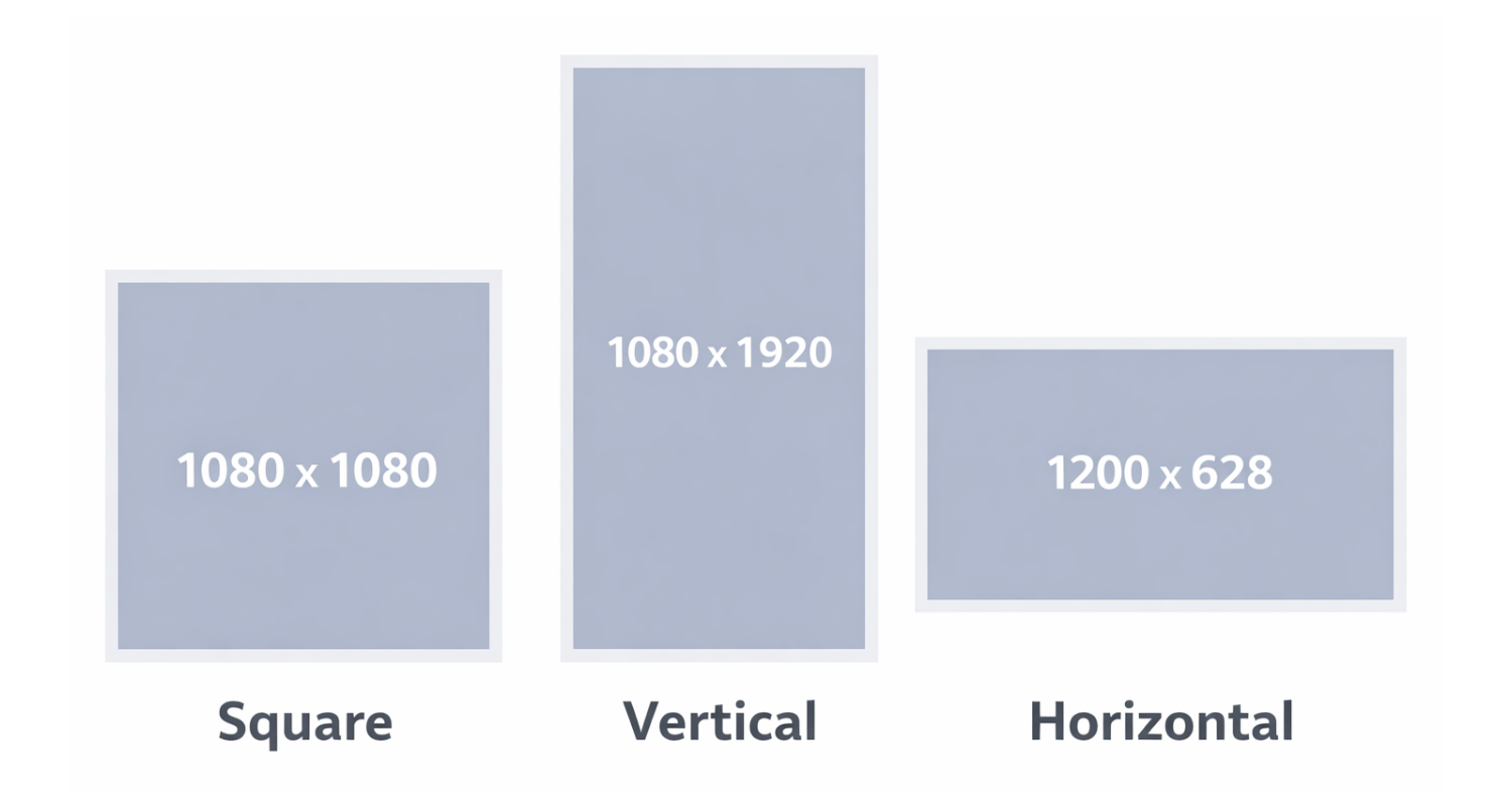
We recommend developing up to 5 distinct designs, each built in 3 sizes:
Square: 1080 × 1080 px (1:1)
Vertical: 1080 × 1920 px (9:16)
Horizontal: 1200 × 628 px (1.91:1)
Why Three Sizes?
Meta distributes ads across multiple placements; Feeds, Stories, Reels, in-stream, right column, and more. Each placement favors different aspect ratios. Providing three sizes ensures:
Full creative control across placements
No awkward cropping or auto-adjustments
Better visual dominance in vertical placements (especially Reels and Stories)
Stronger performance due to placement optimization
Vertical (9:16) is especially important, as Meta increasingly prioritizes immersive, full-screen placements.
Safe Zones & Layout Protection
Meta may crop or overlay interface elements (profile icons, CTA buttons, captions) depending on placement.
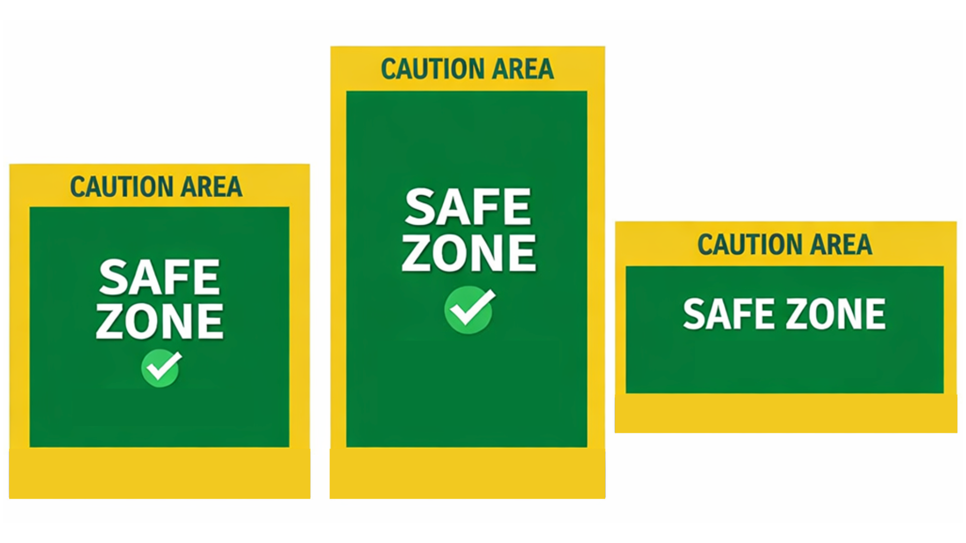
Safe Zone Guidelines
Keep all essential text and logos at least 10% away from edges on square and horizontal images.
On vertical (1080 × 1920), keep key elements within the center 1080 × 1420 px area to avoid cropping in certain placements.
Avoid placing text at the very top or bottom where UI overlays may appear.
Why This Matters
If key messaging is cut off, performance drops. Protecting the safe zone ensures clarity across placements and devices.
Text on Image: Best Practices
Meta no longer enforces the strict 20% text rule, but heavy text still reduces performance.
1. Use Large, Legible Fonts
Small text disappears on mobile screens. Most users view ads on phones.
Rationale: If it cannot be read instantly while scrolling, it will be ignored.
2. Use Fewer Words
Aim for a short phrase or single strong statement.
Avoid paragraphs. Avoid dense information.
Rationale: The image should interrupt the scroll. The Primary Text field does the explaining.
3. Use Clear, Compelling Copy
Effective image text options include:
Short excerpts
Testimonials or endorsements
Awards or recognitions
Unique selling propositions (USPs)
Key benefits
Pain-point-driven statements
Surprising statistics
Taglines
Bold claims
Outcomes or transformations
Event themes or hooks
Limited-time positioning (without urgency clutter)
4. Do Not Include Calls to Action on the Image
Avoid phrases like:
“Buy Now”
“Register Today”
“Learn More”
“Subscribe Now”
Rationale: Meta automatically adds CTA buttons. Redundant CTAs create visual clutter and makes the ad feel more like an ad and less like organic content (reducing engagement). Keeping the creative focused on a core value proposition typically results in a cleaner, more native-looking ad that performs better in-feed.
5. Do Not Repeat Copy Across Fields
Avoid repeating the same text:
On the image
In the headline
In the description
At the beginning of the primary text
Each field should serve a distinct purpose.
Rationale: Repetition wastes valuable messaging space and reduces engagement.
Design Best Practices
1. Faces Should Be Close and looking toward the Camera
If using people:
Crop tightly
Show expression
Make eye contact
Rationale: Human faces increase attention and emotional connection. Distant faces lose impact on small screens.
2. Avoid Overly “Stock Photo” Imagery
Choose images that feel authentic and specific to your audience.
Avoid visuals that:
Feel staged or overly posed
Use exaggerated expressions
Show generic office scenes or handshake imagery
Look overly polished or artificially lit
Could apply to any industry
Rationale:
Users scroll quickly and instinctively ignore anything that looks like a traditional advertisement. When imagery feels generic or staged, engagement drops. Ads perform better when visuals feel real, relatable, contextual, and emotionally genuine.
Whenever possible, use real photography from your organization (actual speakers, authors, staff, products, or community members). If stock imagery is necessary, choose candid-style photos with natural lighting and minimal editing.
3. Ensure Strong Contrast
The subject should clearly stand out from the background.
Use contrasting colors
Avoid busy patterns
Ensure readable typography
Rationale: Ads compete in crowded feeds. Visual clarity wins.
4. Avoid Heavy Filters or Overlays
Do not apply filters that:
Obscure brand colors
Reduce clarity
Make text harder to read
Rationale: Clean, crisp visuals perform better and maintain brand trust.
5. Avoid Overcrowding
Too many elements create confusion.
Keep:
One focal point
One core message
Clean hierarchy
Event Promotion Best Practices
One Speaker Per Creative (When Possible)
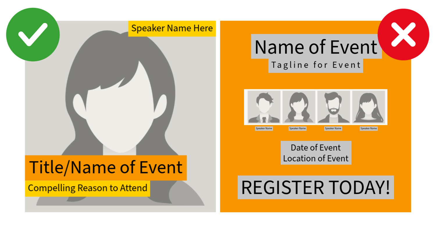
When promoting multi-speaker events, webinars, online courses, etc.:
Avoid:
Multiple speaker headshots
Multiple small names
Dense agendas on the image
Instead:
Dedicate one design per featured speaker
Highlight one strong quote or topic
Rotate creatives across speakers
Rationale: When multiple speakers are shown, each face and name becomes too small to register. Focus increases clarity and recognition.
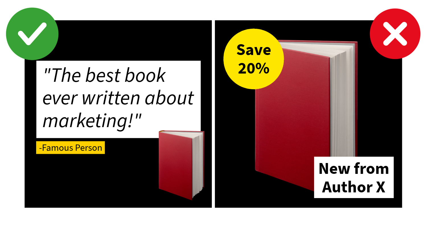
Book Marketing Creative Best Practices
When promoting a book in Meta Ads, the goal is not simply to show the cover; it’s to communicate why the book matters.
Books are emotional purchases. Strong creative highlights meaning, credibility, or transformation, not just availability.
1. Make the Book Cover the Hero
The book cover should be:
Large
Clear
Easily readable on mobile
Not reduced to make room for excessive text
Rationale:
If users cannot immediately recognize the book, the ad loses clarity. The cover is the primary brand asset and should anchor the design.
2. Avoid TemplateD Language
Many publishers default to creative that says:
“New from [Publisher]”
“Available Wherever Books Are Sold”
“20% Off”
While these are technically accurate, they rarely motivate action.
Rationale:
Availability is not a value proposition. Users scrolling social media are not looking for inventory updates; they are looking for something meaningful, helpful, inspiring, or entertaining.
Meta already includes a CTA button. The image should sell the why, not the logistics.
3. Lead with Credibility or Impact Instead
Stronger image copy options include:
A short endorsement from a recognizable voice
An award or recognition
Bestseller status
A powerful excerpt line
A bold promise or claim
A clear problem the book addresses
A transformation statement
A compelling question
A surprising statistic
A strong audience callout (“For parents navigating screen culture…”)
Rationale:
Specificity builds trust. Social proof and clarity outperform generic launch language every time.
4. Focus on the Reader, Not the Release
Instead of centering the creative on:
The publisher
The release announcement
Distribution language
Center it on:
The reader’s struggle
The reader’s aspiration
The change the book helps create
Rationale:
Readers do not buy books because they are new. They buy books because they feel seen, helped, challenged, or inspired.
5. Consider Context or Lifestyle Mockups
In addition to the flat cover, test:
The book in someone’s hands
A desk or reading environment
A styled but realistic lifestyle setting
A subtle 3D mockup
Rationale:
Context helps users imagine ownership. Lifestyle-driven creative often feels less promotional and more native to the feed.
6. Use the Author Strategically
If the author has:
Name recognition
A speaking platform
Media credibility
A strong personal brand
Test creative that features:
A close-up of the author
The author alongside the book
An author quote as the primary hook
Rationale:
Authority and familiarity increase engagement, particularly for nonfiction.
7. Avoid Overcrowding
Do not stack:
Multiple endorsements
Several award seals
Discount badges
Long excerpts
Choose one primary hook per design variation.
Rationale:
Clarity wins. When too many credibility signals compete, none stand out.
8. Test Messaging Angles, Not Just Background Colors
Strong testing variations for books might include:
Endorsement-focused
Excerpt-focused
Problem-solution driven
Audience-specific
Award/bestseller positioning
Author-first creative
Rationale:
Performance differences usually come from messaging angle, not subtle design tweaks.
Video Creative Best Practices & Specs
Video is increasingly prioritized in Meta placements, particularly Reels.
Recommended Ratios
Vertical (9:16): 1080 × 1920 px (Primary recommendation)
Square (1:1): 1080 × 1080 px
Horizontal (16:9): 1920 × 1080 px
Ideal Length
6–15 seconds: Strong for cold audiences
15–30 seconds: Ideal balance for engagement and retention
Up to 60 seconds: For warmer audiences or deeper storytelling
Rationale: Attention drops quickly. Shorter videos typically outperform longer ones in paid placements.
Video Creative Guidelines
1. Hook in the First 3 Seconds
Start with:
A bold statement
A question
Movement
A compelling visual
Rationale: If you lose attention early, Meta’s algorithm deprioritizes delivery.
2. Design for Sound-Off Viewing
Include:
Captions
On-screen text
Most users watch without sound.
3. Keep Text Large and Minimal
Just like static images.
4. Avoid Slow Intros or Logo Animations
Branding can appear, but not before engagement.
Rationale: Early drop-off hurts performance metrics.
5. Maintain Visual Movement
Subtle motion keeps attention:
Zoom effects
Animated typography
Scene changes
Technical File Recommendations
Image Files:
JPG or PNG
Under 30 MB
RGB color profile
Video Files:
MP4 (recommended)
Under 4 GB
H.264 compression
1080p resolution preferred
Creative Testing Strategy
We recommend:
Up to 5 design variations
Each built in 3 sizes
Testing different messaging angles, not just color changes
Examples of variation types:
Quote vs. benefit-driven
Emotional vs. practical
Product-focused vs. outcome-focused
Speaker highlight vs. theme highlight
Rationale: Performance differences are often driven by messaging angle, not minor design tweaks.
Final Creative Checklist
Before launch, confirm:
Three aspect ratios provided
Safe zones respected
Minimal text on image
No CTA language on image
No repeated copy across fields
Clear focal point
High contrast
Mobile-first readability
Product or speaker large and prominent
Multiple design variations prepared
Why These Best Practices Matter
Meta Ads is an attention marketplace. The brands that win are not the ones with the most information, but the ones with the clearest, boldest, most focused creative. By designing specifically for placements, mobile viewing, and user behavior, you maximize performance before budget is ever spent.